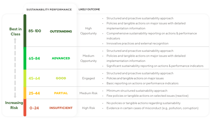
Scores
The score allows companies to benchmark against their industry peer, but it also helps situate the company’s overall sustainability performance in absolute terms. This scale is applicable for each theme and for the overall score. It has been intentionally designed in order to leave room for improvement.
Average type of scores over the years
Average scores and their progression
Boxplots (also called box and whiskers plots) allow us to visualise the distribution or spread of a dataset and summarize some key numbers. To build each boxplot, data is first put in ascending order.
The "box" part contains 50% of our data and more specifically the middle part of our data. The box contains three horizontal lines:
- The lower line of the box represents the first quartile (Q1), which indicates that 25% of our data are below this line and 75% are above this line.
- The middle line inside the box represents the median (Q2), which indicates that 50% of our data are below this line and 50% are above this line. Its the middle value of our dataset.
- The upper line of the box represents the third quartile (Q3), which indicates that 75% of our data are below this line.
The "whiskers" (smaller vertical lines above and below the box) end on the minimum and maximum values of our data besides the outliers. They are calculated with : Q1 - 1.5 * (Q3-Q1) for the minimum and Q3 + 1.5 * (Q3-Q1) for the maximum. The outliers are represented by dots on our graphic, they are values that fall outside the whiskers and are thus distant from the majority of the data.
BoxPlot for scores worldwide over the years
Distribution of $BUTTON1 scores in $BUTTON2
Performance Distribution of Companies in the EcoVadis Network ($FIRST-$LAST) [$BUTTON1]
Distribution of $BUTTON1 scores
Progression of Companies Assessed in $FIRST and Again in $LAST
Table for Sankey
This calculation analyzes the scores of suppliers over time to determine the speed of their progression. By comparing the score of an assessment with the previous assessment for each supplier, we calculate the difference in scores and divides it by the number of years between the two scores. The result is an average measure of how quickly suppliers are improving their scores, categorized by size and region.
Number of points gained per year, by size and region